Beas of Bloomsbury

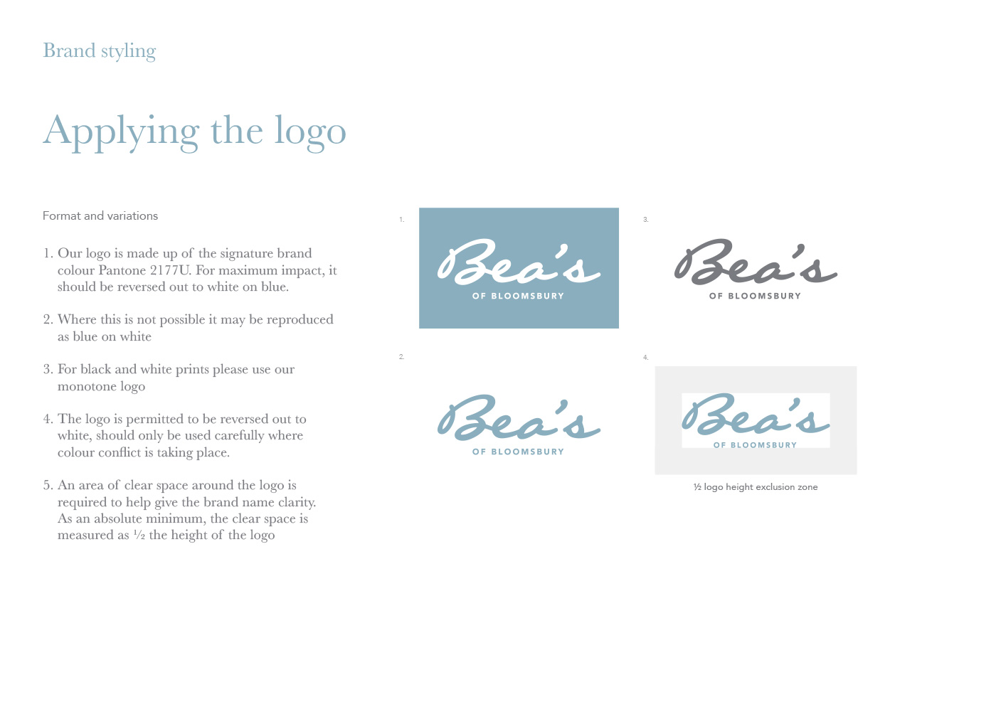
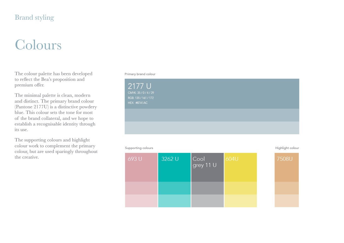
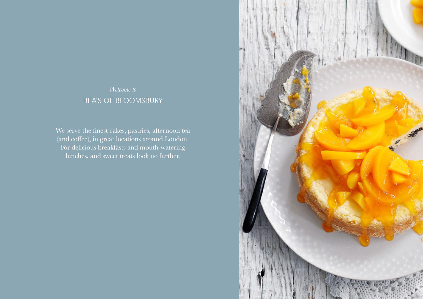
Bea’s has a long and proud reputation of baking great cakes, but changes in management and tastes had rendered their image a little stale. The aim of this project was to develop and refine the Bea’s visual identity and guidelines. Bringing their story up to date with a refreshed colour palette, new imagery and tone of voice.

Looking first at the colour palette, my initial job was to establish a signature blue to underpin the whole identity of the brand.

Alighting on a dusty grey/blue, we established a tone that was both elegant and feminine. The supporting palette of pink, jade, grey and lemon work beautifully as supporting colours. As accent colours they are bright, lively and sugary against the more sober blue.

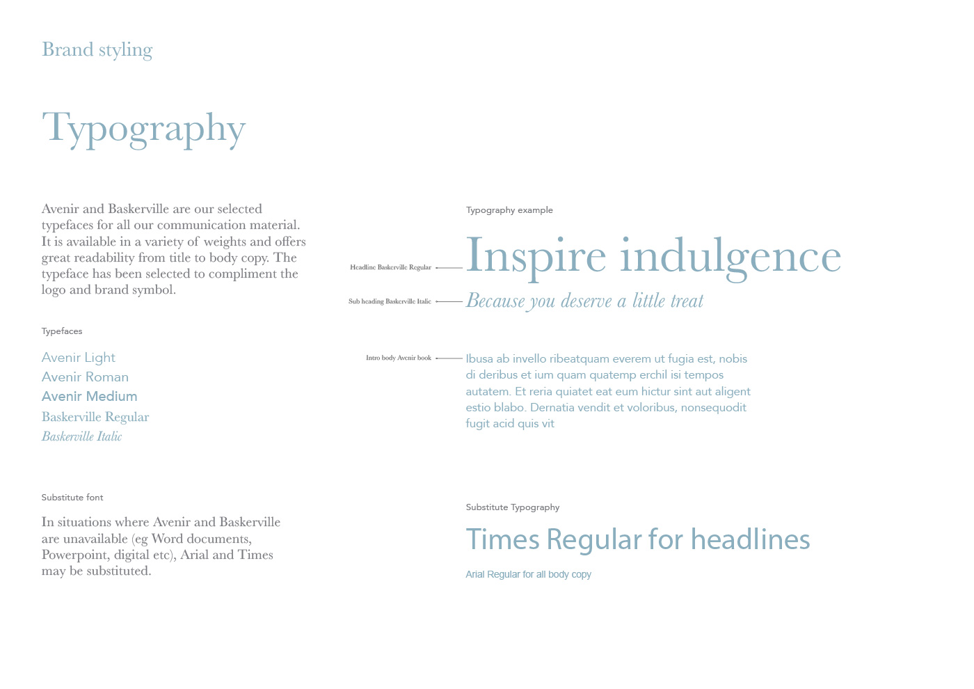
Tapping in to a sense of history and traditional values was important for the brand identity, and for this reason Baskerville was selected for headline copy. 

The end result is a mature, elegant and consistent identity for a discerning clientelle.