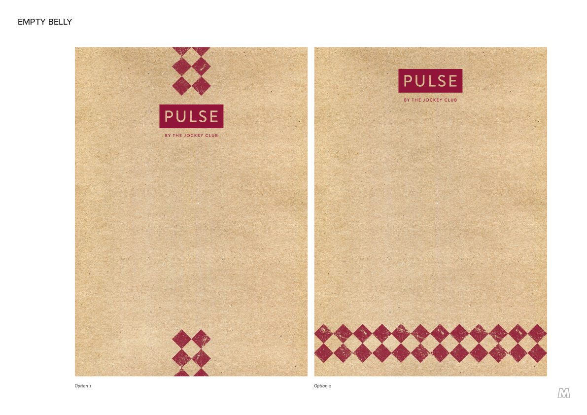

For this project, I designed an identity and packaging for a new grab ‘n’ go range at the Jockey Club racecourses. The name ‘Pulse’ was chosen to denote the action and adrenalin of the track.
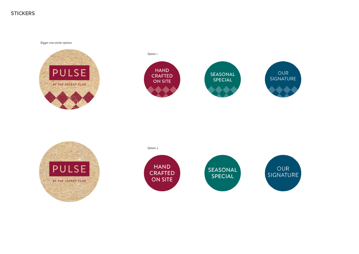
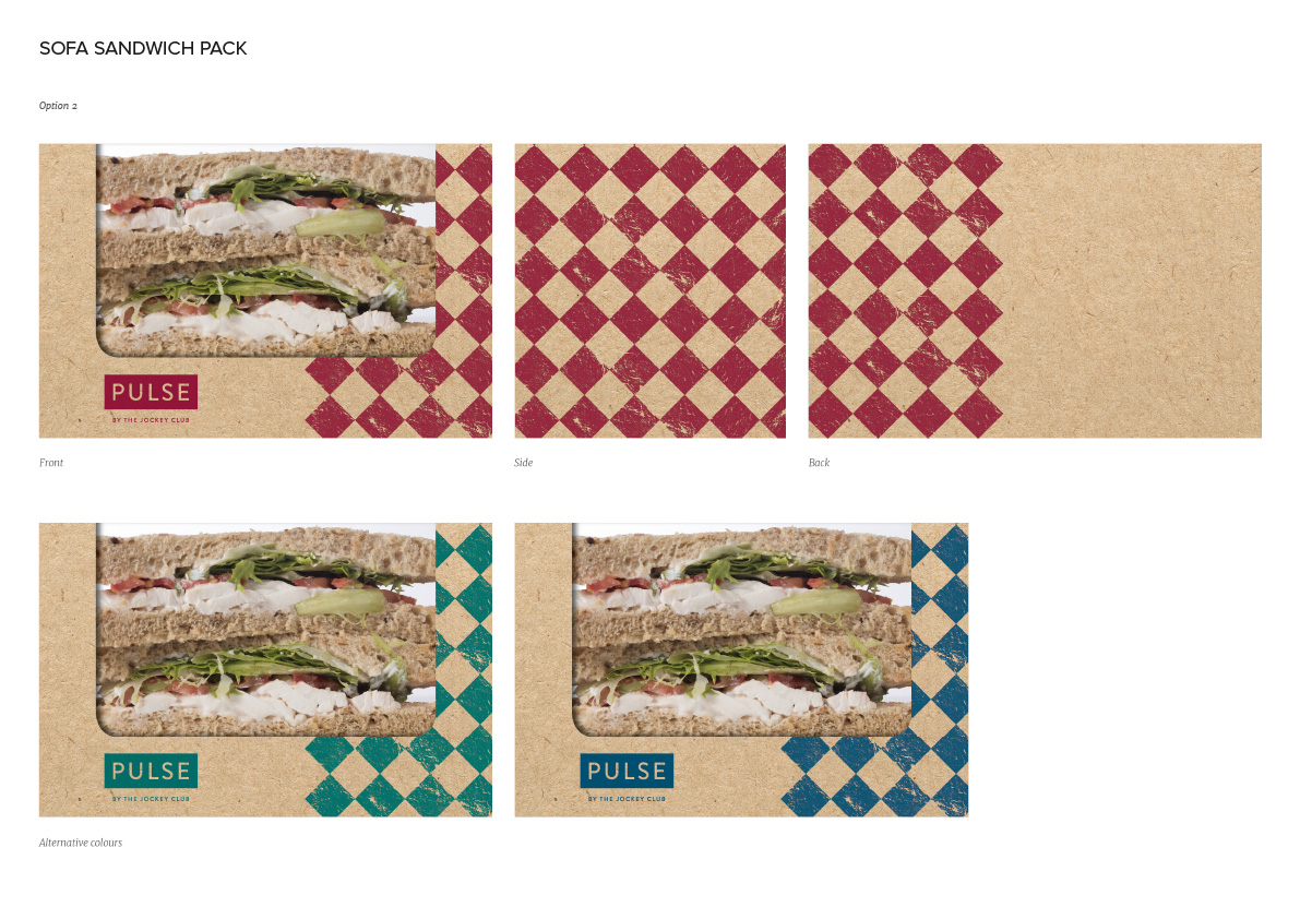
Using a chequered pattern on the packaging, I created a distinctive identity which was reminiscent of both racing jerseys and gingham tablecloths. Distressing the texture of the pattern created more of a heritage feel. This worked particularly well on the texture of the recycled card packaging.
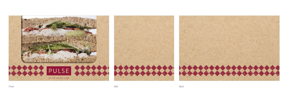
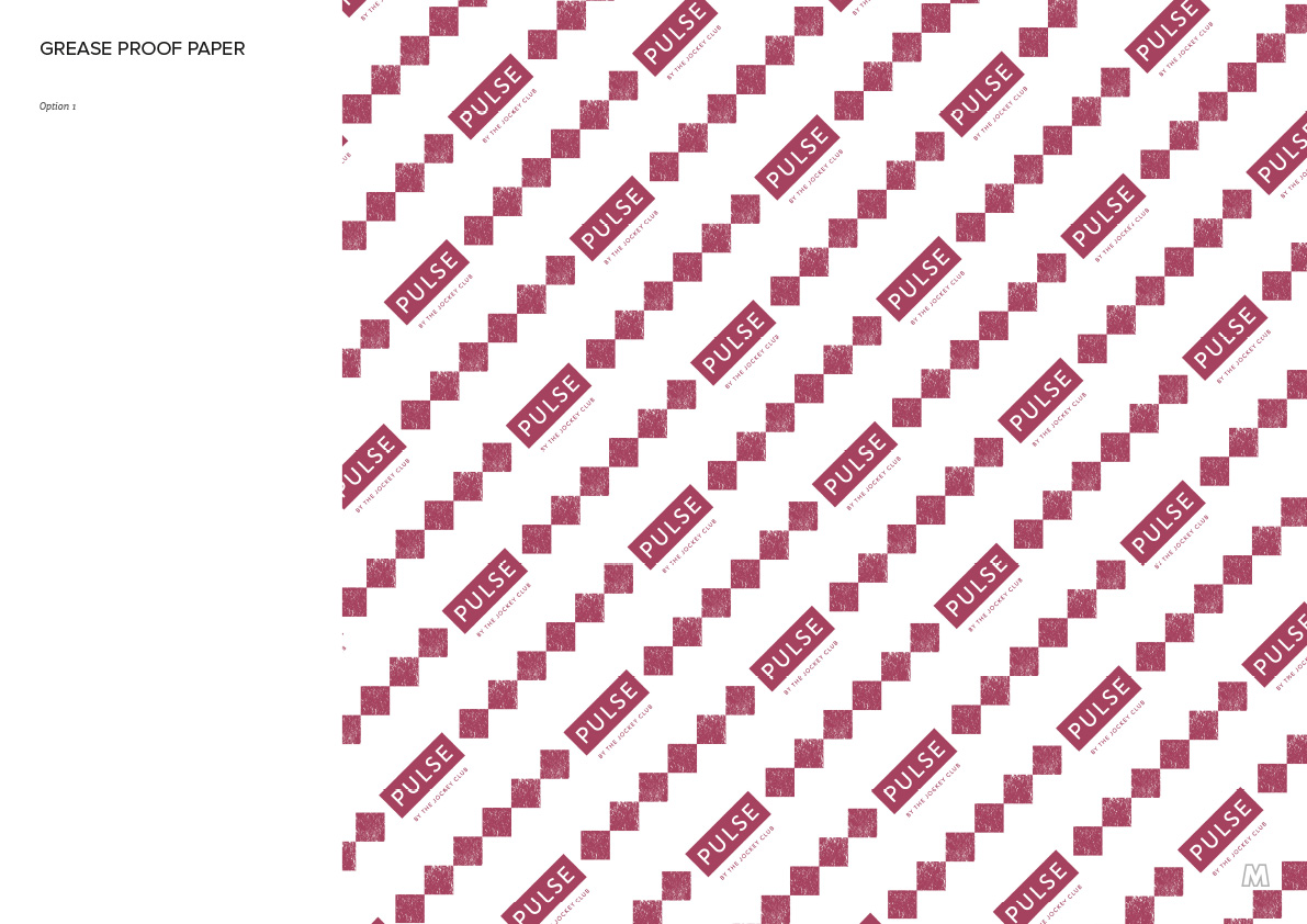
This greaseproof paper design shows how the logo was integrated into the diamond pattern. Using plenty of white space, I kept the design clean and simple.