

As part of the Woolwich Estates Renewal Programme, Lovell Homes has an ambitious 12 year programme to transform 3 run-down council estates into 1,500 high-quality, mix tenure homes. Working closely with the London Borough of Greenwich and asra Housing Association, this flagship scheme will play a key role in enhancing communities and rejuvenating the area to make the borough an even better place to live.
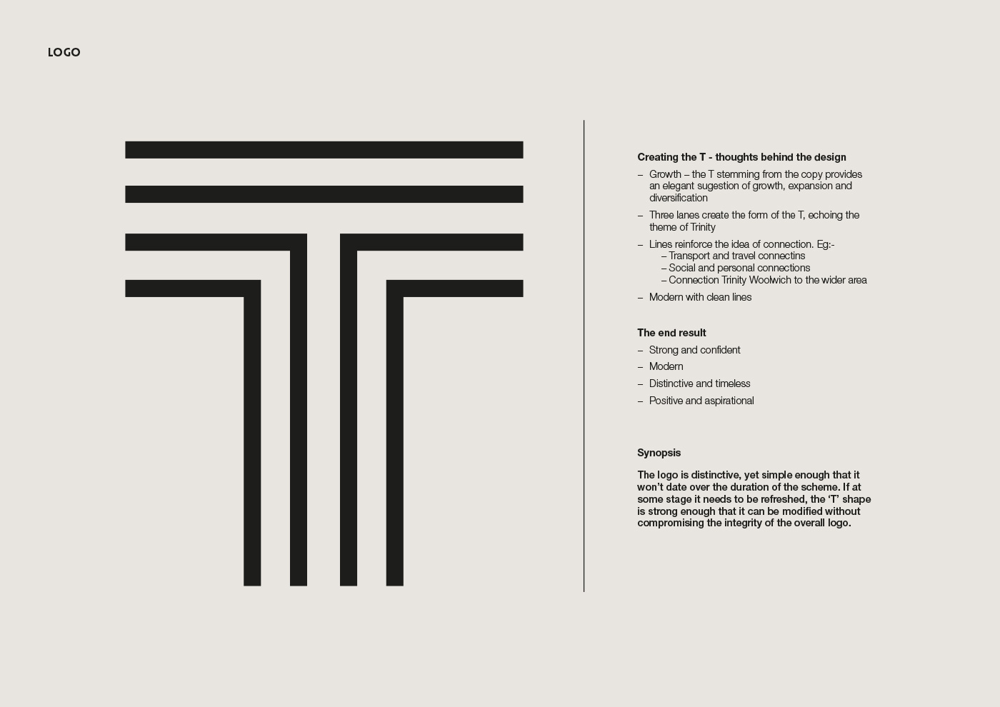
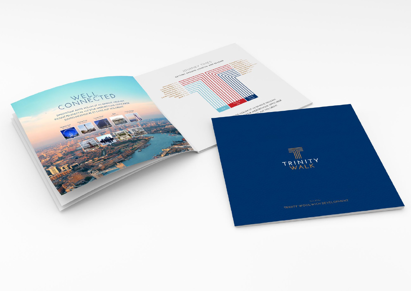
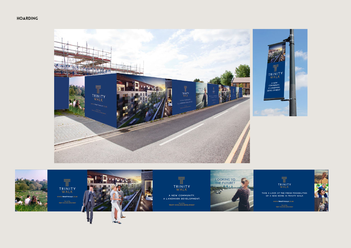
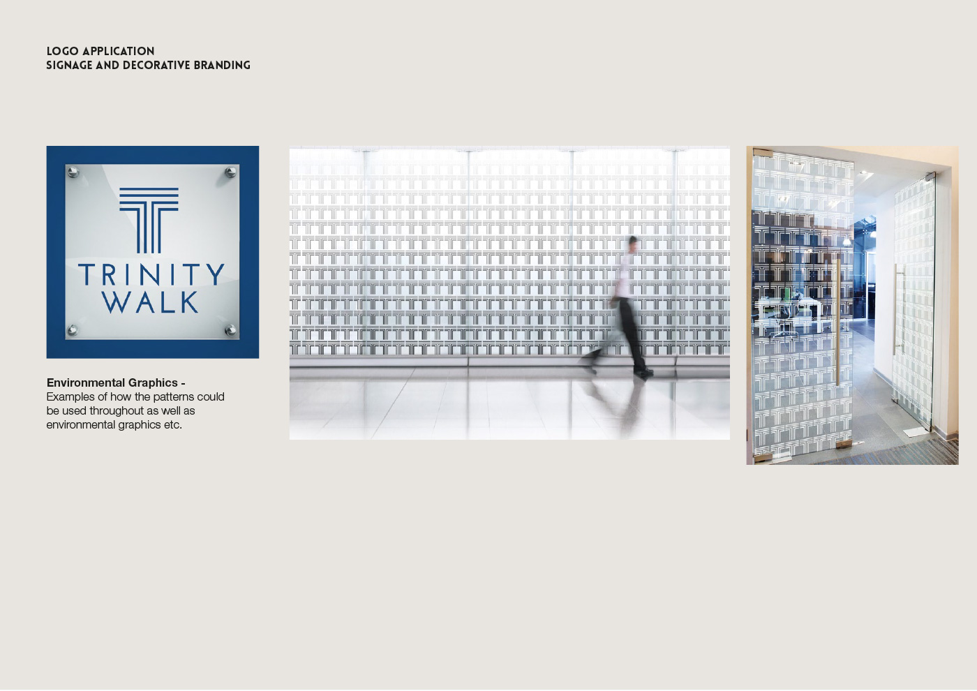
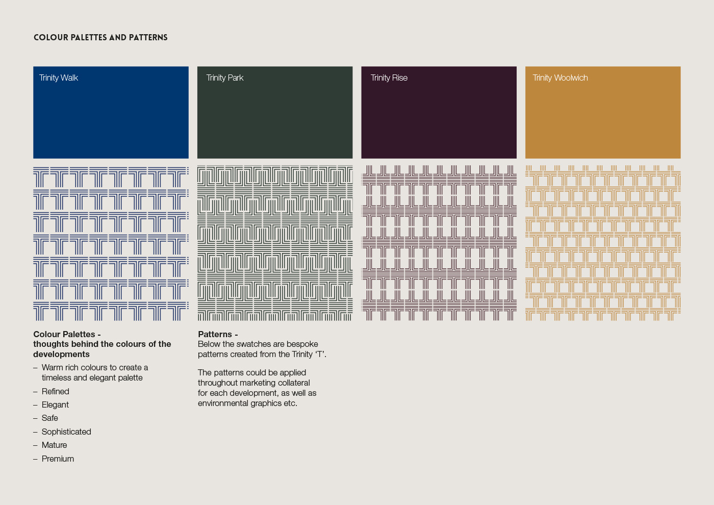
The ‘T’ shape became the main mark (playing on the ‘Trinity’ and the 3 phases) and represented a solid, safe investment. I avoided any ‘on-trend’ design styles and instead used strong, clean lines and an elegant typeface to give a timeless feel. From this, I created 3 subsequent sub-brands to represent each development – Trinity Walk, Trinity Rise and Trinity Park.
Different colour palettes were chosen to represent each stage of the development. Additionally, unique patterns created from the ‘T’ shape were also ascribed.